

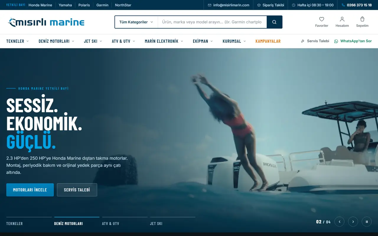
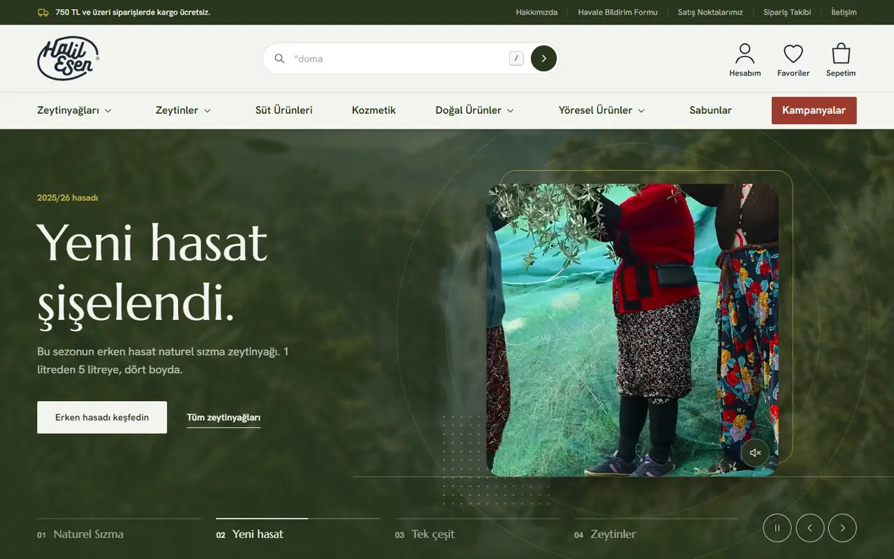

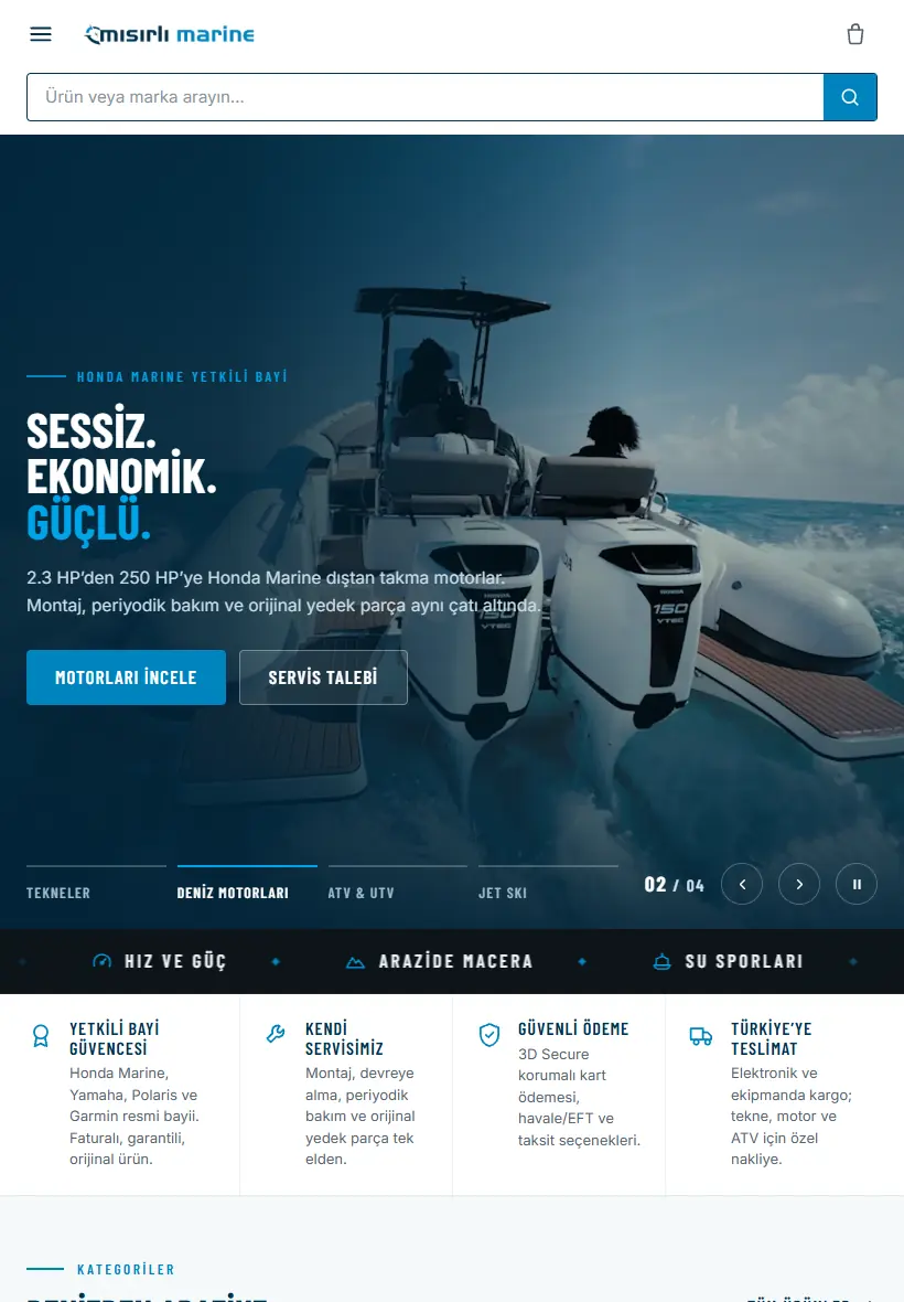
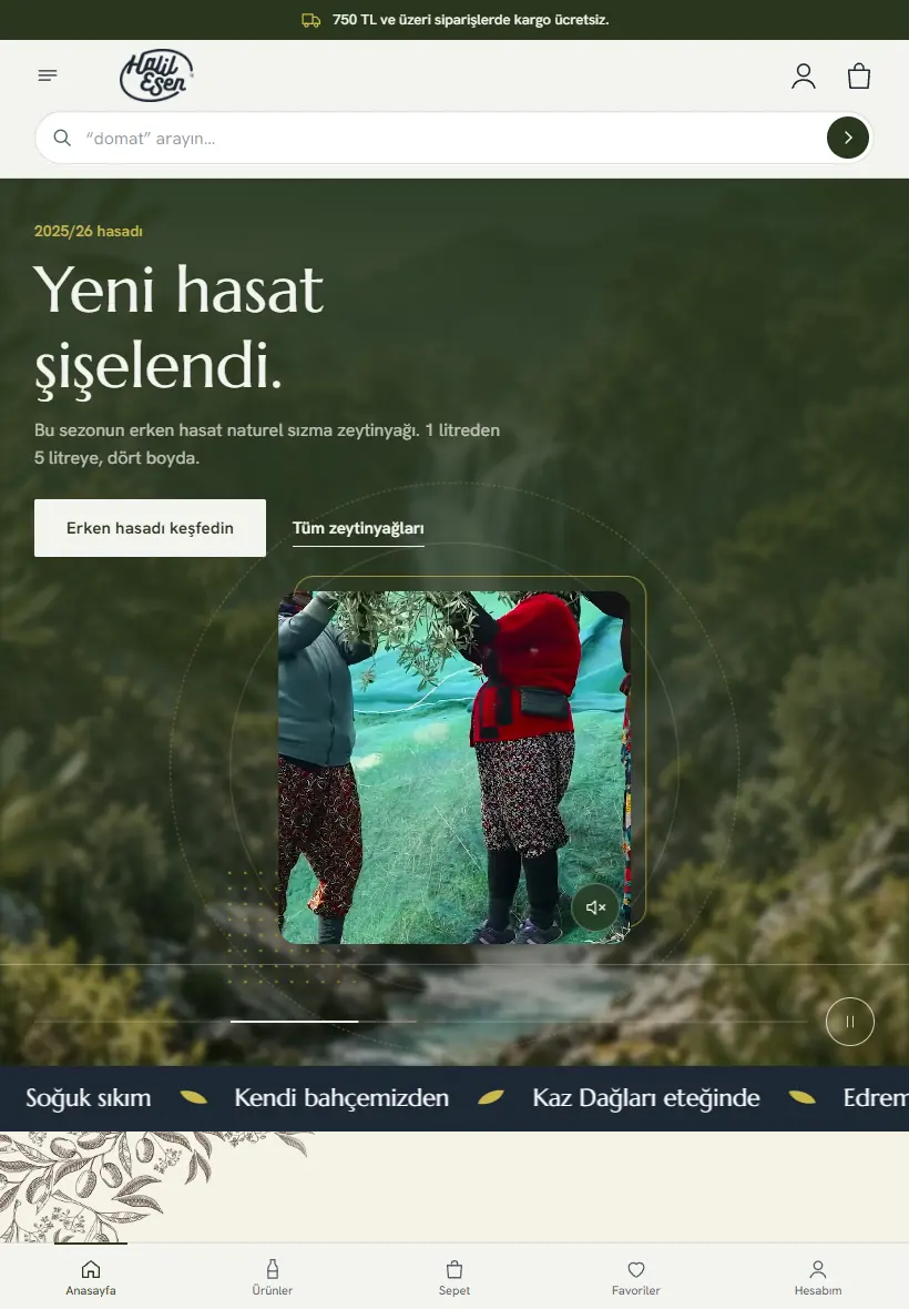




Mobile-responsive web design light effect
Mobile-responsive design page line

Mobile-Responsive Design That Makes Your Website Look Flawless on Phones, Tablets and Desktops

What Is Mobile-Responsive Design?

Mobile-responsive design is an approach that ensures a website looks smooth across different screen sizes such as phones and tablets. Today, a large share of internet users access websites through mobile devices. For this reason, it is no longer enough for a website to look good only on desktop.

It is very important that content adapts correctly to small screens, images appear properly and buttons are easy to use. Mobile-responsive design is one of the core elements that strengthens user experience and supports digital success. At Aurora Yazılım, we treat mobile compatibility not as something added later, but as a core building block of every web project.

  • Responsive Web Design
  • Mobile-First Page Structure
  • Fast and Smooth Mobile Experience
  • Balanced Appearance on All Devices
Mobile-responsive web design
01 02 03

03

The core stage of our mobile-responsive design process

Mobile-responsive design process

Why Has Mobile Usage Become So Important?

Usage Habits Have Changed

Users now perform many actions on phones instead of computers. When researching products, reviewing services or looking for contact information, the first choice is often a mobile device.

A Poor Mobile Experience Loses Users

Text that does not fit the screen, overflowing images, hard-to-click buttons and complex menus can quickly drive visitors away. A mobile-responsive structure provides users with a comfortable and trustworthy experience.

The Same Quality on Every Device

A website that works properly on phone, tablet and desktop screens helps your brand look more professional online and allows users to move through the site more comfortably.

Why Is Mobile-Responsive Design Important?

When a visitor enters your website from a phone, they want easy access to content. If the layout breaks when the page opens, text becomes too small or the menu is hard to use, the user tends to leave. A mobile-responsive design keeps the page organized on every screen.

This structure helps visitors stay on the site longer. The better the mobile experience, the higher user satisfaction becomes. This contributes positively to both brand perception and conversion rates.

  • Better user satisfaction
  • Longer session duration
  • Stronger brand perception
  • Higher contact rate

Directly Strengthens User Experience

Comfortable Use

Mobile-responsive design enables visitors to use the website comfortably. Practical menus, buttons that are easy to tap with a finger and clearly readable content are the foundation of this experience.

More Page Views

When users can navigate the site without difficulty, they review services more comfortably and become more willing to contact you. When the user feels comfortable, they continue viewing more pages instead of leaving.

Strong Impact on Service and Product Pages

When the mobile experience is strong on corporate websites, e-commerce projects, restaurants, hotels and service pages, response rates also increase.

What Should Be Considered in Mobile-Responsive Design?

Correct Screen Layout

Successful mobile design is not simply about shrinking the screen. The page structure must work correctly on every device, font sizes must be readable and images must not overflow.

Use of Spacing and Balance

A cramped structure tires the user, while overly scattered areas disrupt page integrity. In mobile design, the goal is to make every piece of content simpler and more usable.

Menu, Button and Content Flow

A simple menu, clear buttons and a clear content flow strengthen the mobile experience. Areas such as get a quote, call, contact us or view product details should be clearly visible on mobile.

The Relationship Between Mobile Design and Speed

Mobile-responsive design is not limited to appearance. Fast page loading is also an important part of mobile success. Visitors using phones do not like waiting, especially on mobile internet connections, and slow-loading sites are quickly abandoned.

Unnecessarily large images, heavy code structures and unoptimized areas negatively affect mobile performance. A lighter, smoother and well-planned structure significantly increases user satisfaction. For this reason, mobile compatibility and performance should be considered together.

  • Use of optimized images
  • Lightweight and smooth code structure
  • Fast loading on mobile networks
  • Lower abandonment rate

Fast-Loading Pages Bring More Engagement

Longer Session Duration

When a website loads quickly on mobile, visitors can focus on content more easily. As waiting time between pages decreases, the user experience becomes stronger and session duration increases.

A Major Advantage Across Different Industries

A fast mobile structure provides a significant advantage for service promotion websites, restaurant and hotel projects, e-commerce structures and corporate pages.

Why Is Mobile-Responsive Design Valuable for SEO?

Search Engines Care About User Experience

Search engines evaluate websites that prioritize user experience more favorably. Sites that work smoothly on mobile provide visitors with a higher-quality experience.

Supports SEO Performance

On mobile-incompatible pages, bounce rates increase and this can weaken SEO performance. A mobile-responsive structure, together with technical infrastructure and content organization, becomes a strong digital investment.

More Visibility and a Stronger Digital Structure

A mobile-friendly site contributes not only to users but also to the brand in the long term. Pages that provide a better experience help more visitors stay on the site. This strengthens brand awareness and supports digital visibility.

Especially in highly competitive industries, mobile compatibility creates a strong advantage for standing out from competitors. Every detail that makes things easier for users contributes directly to the brand’s digital success.

  • Stronger digital visibility
  • A user experience that stands out from competitors
  • Stronger technical infrastructure
  • Long-term brand advantage

What Does Mobile-Responsive Design Bring to Businesses?

Customer Satisfaction

A well-prepared mobile design is not only a technical improvement for businesses. It also means increased customer satisfaction, trust and conversions.

More Willing User Behavior

When users can move comfortably on mobile, they understand services better, review products in more detail and become more willing to make contact.

Strengthens Brand Image

Quality Perception

A site that looks professional and works smoothly on every device increases the brand’s quality perception. Users trust technically well-prepared websites more.

A Sign of Corporate Strength

A page that displays properly on the screen, has easily readable content and offers simple contact steps gives the brand a positive image. In this sense, mobile-responsive design is a sign of corporate strength.

Mobile-Responsive Design Solutions with Aurora Yazılım

At Aurora Yazılım, we see mobile compatibility as one of the core building blocks of the web projects we develop. We make sure the designs look strong not only on desktop, but also on all mobile devices. In every project, screen compatibility, speed, ease of use and visual balance are evaluated together.

As a result, we deliver outcomes that are strong both aesthetically and functionally. Our goal is to help your brand reach every user smoothly in the digital world and provide you with a sustainable web infrastructure.

  • Screen compatibility and visual balance
  • Speed and ease of use
  • Sustainable web infrastructure
  • Professional appearance on every device

Structures That Look Strong on Every Screen

Every business’s target audience uses different devices. That is why the design must offer the same quality across all screen sizes. At Aurora Yazılım, we place user experience at the center of the mobile-responsive designs we create.

We simplify the page structure, place content in a balanced way and create a system that can be used comfortably on every device. This way, your website both looks strong and gains a modern digital structure that meets visitor expectations.

  • Phone, tablet and desktop compatibility
  • Balanced content placement
  • Easily readable page structure
  • Modern mobile experience
Responsive design

Responsive Design

We provide a modern web design structure that adapts to screen size on phones, tablets and desktops.

Touch-friendly design

Touch-Friendly

We prepare buttons that are easy to tap with a finger, simple menus and easy-to-use mobile interfaces.

Fast mobile loading

Fast Loading

We develop high-performance sites that load faster on mobile networks with optimized images and lightweight code structures.

Google mobile compatibility

Google Compatibility

We build infrastructures that support your search engine performance with mobile-responsive, fast and user-friendly structures.

FREQUENTLY ASKED QUESTIONS
Mobile-responsive design frequently asked questions
  • What does mobile-responsive design mean?
    Mobile-responsive design is a design approach that ensures a website works without breaking, remains readable and can be used comfortably across different screen sizes such as phones, tablets and desktops.
  • Is mobile compatibility important for SEO?
    Yes. Mobile compatibility directly affects user experience. Pages that are difficult to use or slow to load on mobile can cause user loss. This can also negatively affect SEO performance.
  • Can my existing website be made mobile-responsive?
    Yes. Depending on the structure of the existing site, responsive adjustments, mobile view improvements, image optimization and user experience refinements can be applied.
  • Why is speed important in mobile-responsive design?
    Mobile users expect fast results. Slow-loading pages can cause users to leave the site. That is why image optimization, a lightweight code structure and fast loading are important parts of mobile design.
  • What does a mobile-responsive website bring to a business?
    A mobile-responsive site increases user satisfaction, strengthens brand image, helps visitors stay on the site longer and supports contact or sales conversions.

We offer mobile-responsive web design solutions that are fast, readable, user-friendly and professional-looking on phones, tablets and desktops.