

What Makes a Good Logo? 12 Principles
We list the 12 principles of a good logo, such as simplicity, scalability and originality, along with color choice, file formats and common mistakes in the design process.
 Aurora YazılımEditorial team
6 min read
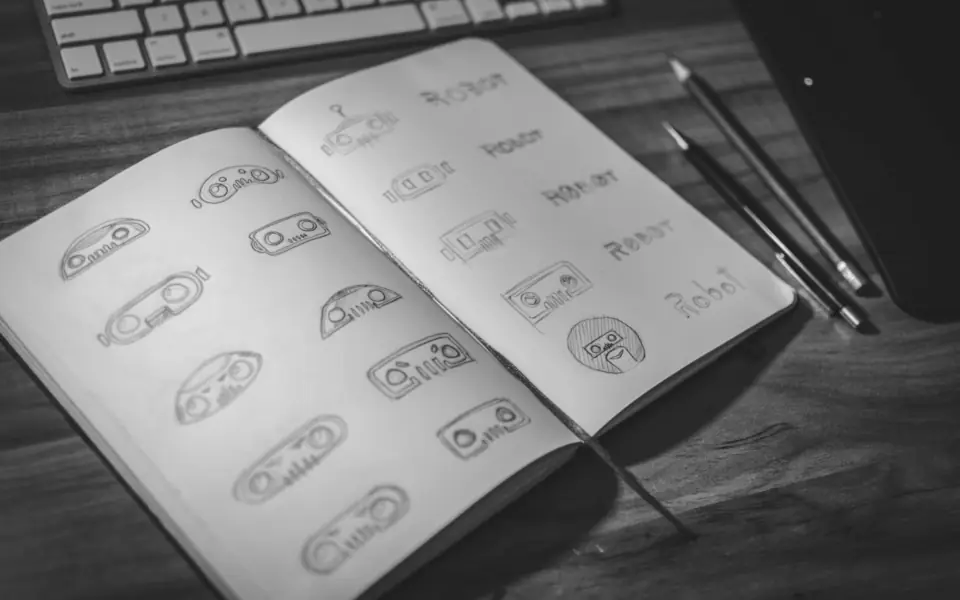
A good logo design should be simple, legible at both small and large sizes, work in a single color, suit the brand's character and be original. A memorable logo that does not chase fashion trends and looks equally strong on different surfaces (screen, signage, packaging, social media profile) serves a brand for years.
What Does a Logo Do for a Brand?
A logo is the brand's signature. A customer sees you for the first time on a sign, in a social media post or on a product package, and the first mark that catches their eye at that moment is the logo. Its job is to introduce the brand and remind people of it when they see it again, not to tell the brand's whole story on its own.
That is why good logo design relies on subtraction more than decoration. A logo works as part of a system together with the color palette, typefaces and visual language. We covered that whole system in our article what is brand identity. The 12 principles below are about the logo itself.
Principles of Simplicity and Clarity
1. Keep it simple
Most memorable logos are made of a few simple shapes. Too much detail gets muddy at small sizes and makes the logo harder to remember. If you can see a logo for a few seconds and sketch it roughly on paper, you are on the right track.
2. Focus on a single message
Trying to fit the product, the city, the values and the founding year into one logo is a common mistake. A logo should carry a single idea; the remaining messages should be told through the slogan, the website and campaigns.
3. Be readable at first glance
If a logo contains text, the text must be legible. Overly ornate scripts and tangled letters create a legibility problem, especially in the second or two that a passer-by looks at a sign.
Technical Principles: Working at Every Size
4. Make it scalable
The same logo will be used at every size, from the small icon in a browser tab to a sign on a building facade. The logo should be designed as a vector, and a simplified icon version should be prepared for small uses.
5. Make it work in a single color
In cases such as fax, rubber stamps, laser cutting, engraving or one-color printing, a logo loses its colors. A logo that is still recognizable in black and white is always sturdier than one that depends on color. Evaluating the design in black and white first is a good habit.
6. Have variations
Horizontal, vertical and icon-only versions, plus separate versions for light and dark backgrounds, make it easier for the logo to fit everywhere. A square icon version is especially necessary for areas cropped into a circle, such as social media profile photos.
Logo Colors and Typography
7. Choose color deliberately
Logo colors should be chosen by considering industry habits, competitors' colors and the brand's personality together. If all your competitors are blue, choosing blue can inspire trust but makes it harder to stand out. Keeping the number of colors low reduces both printing cost and visual clutter.
8. Be consistent on screen and in print
A color that looks bright on screen can come out dull in print. That is why every color needs defined screen (RGB, HEX) and print (CMYK, and Pantone if needed) equivalents. All of these codes should be included in the corporate identity guide.
9. Let the typeface fit the character
Serif typefaces give a traditional, established feel, while sans-serif typefaces look more modern and clean. If a ready-made typeface is used, its commercial use license should be checked; where possible, letter spacing and forms should be customized for the logo. It should also be tested that Turkish characters (ğ, ş, ı, İ) are drawn correctly.
Principles of Originality and Longevity
10. Be original
Ready-made logo templates and icons found online carry the risk that the same image is used by other businesses too. A logo that is not original is both indistinguishable and can cause problems during trademark registration. Before applying for registration, it is recommended to search for similar marks in the records of the Turkish Patent and Trademark Office.
11. Be timeless
That year's popular effects, shadows and gradients look dated within a few years. For a logo to be usable unchanged for years, it must rest on basic forms that are independent of trends; trends can live on in campaign visuals.
12. Speak to the brand's target audience
A children's toy brand and a law firm's logo should not speak the same language. A logo should be judged not by the designer's or the business owner's personal taste but by the expectations of the target customer. This assessment gives more consistent results when done together with the naming work; for finding a name, see our finding a brand name article.
How to Design a Logo: Process Steps
Professional logo design starts by asking questions before any drawing. Until what the brand does, who it speaks to, how competitors look and where the logo will be used are clear, every draft is a guess. This groundwork is the first step of brand management work.
- Prepare the brand brief: services, target audience, values, competitors, places of use.
- Draw quick pencil sketches and develop more than one idea direction.
- Redraw the strongest ones digitally as vectors and evaluate them in black and white first.
- Try color and typeface alternatives in real usage examples.
- Test on a business card, a sign, a website header and a profile photo.
- Receive the final version with all variations and file formats.
Files You Should Receive
A logo is not just a PNG file. The print shop, the sign maker, the web developer and the social media team all need different formats. Make sure the files below are included at delivery.
| Format | Where it is used | Note |
|---|---|---|
| SVG | Website, app | Vector, sharp at every size, small file |
| PDF / EPS / AI | Print shop, signage, promotional items | Vector source file for printing |
| PNG (transparent) | Presentations, social media, office documents | Should be exported in different sizes |
| Square icon | Profile photo, favicon | Simplified version for small sizes |
Common Logo Design Mistakes
The mistakes below may look small at first glance, but they shorten a logo's life and lead to redesign costs later.
- Industry cliché: every real estate agent using a house roof and every dental clinic using a tooth icon makes it harder to stand out.
- Photos or thin lines: logos that contain photographs or very thin lines disappear at small sizes.
- Decision by committee: a logo where everyone adds an element ends up representing no one.
- Testing only on screen: a logo that has not been tested on real surfaces such as signage, embroidered clothing or a stamp holds surprises.
- Delivery without source files: settling for a low-resolution image only causes problems with every new use.
Getting the Logo Ready for Use
After the logo is approved, the real work begins: carrying it to every touchpoint correctly. On the website the logo must look sharp on both desktop and phone and sit in the menu with enough space; this is part of mobile-responsive design and UI/UX design decisions.
On social media accounts, profile photos, cover images and post templates should be prepared in line with the logo; the social media team plans this transition. Animated or simple uses of the logo in promo videos and campaign visuals are determined during the creative production process.
Frequently Asked Questions
01How many colors should be used in a logo design?
There is no fixed rule, but most strong logos work with one or two main colors. As the number of colors grows, printing costs rise and the logo starts to look complicated at small sizes.
02Does it make sense to have a logo made with AI?
AI tools can be useful for generating ideas and exploring directions. However, the outputs are usually not vector files and carry uncertainty regarding originality and trademark registration; it is safer to have the final logo drawn originally by a designer.
03How often should I change my logo?
As little as possible. Changing a logo means losing recognition; in most cases, simplifying the existing logo and adapting it to digital use is enough instead of a completely new one.
A good logo design creates value for years when it is simple, scalable, original and right for the brand's target audience. If you want your logo designed or refreshed together with your brand strategy, you can talk to our brand management team, and explore our creative production service for the images and videos where the logo will appear.